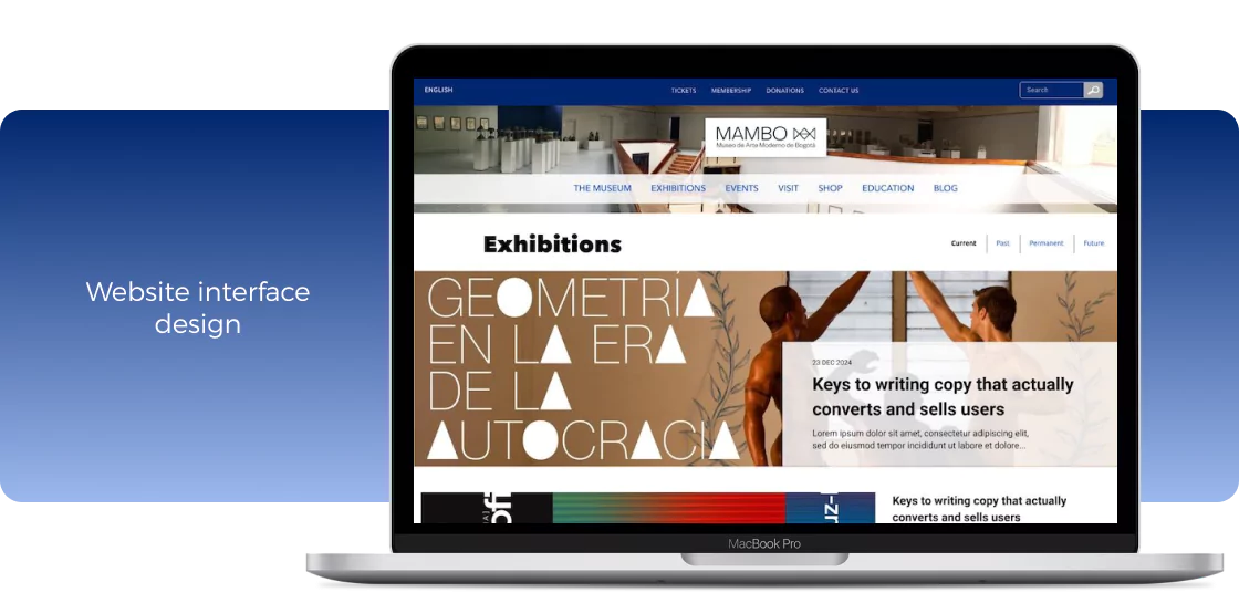
Overview
The problem
The Museum of Modern Art of Bogotá has a website whose image and structure does not align with the standards for such an important place for culture at an international level.
* This project is in evaluation process.
The team
Felipe Silva
(Diseñador UX)
The goals
The current website presents an old-fashion style that needs to be updated in order to be aligned with the modern character of the institution.
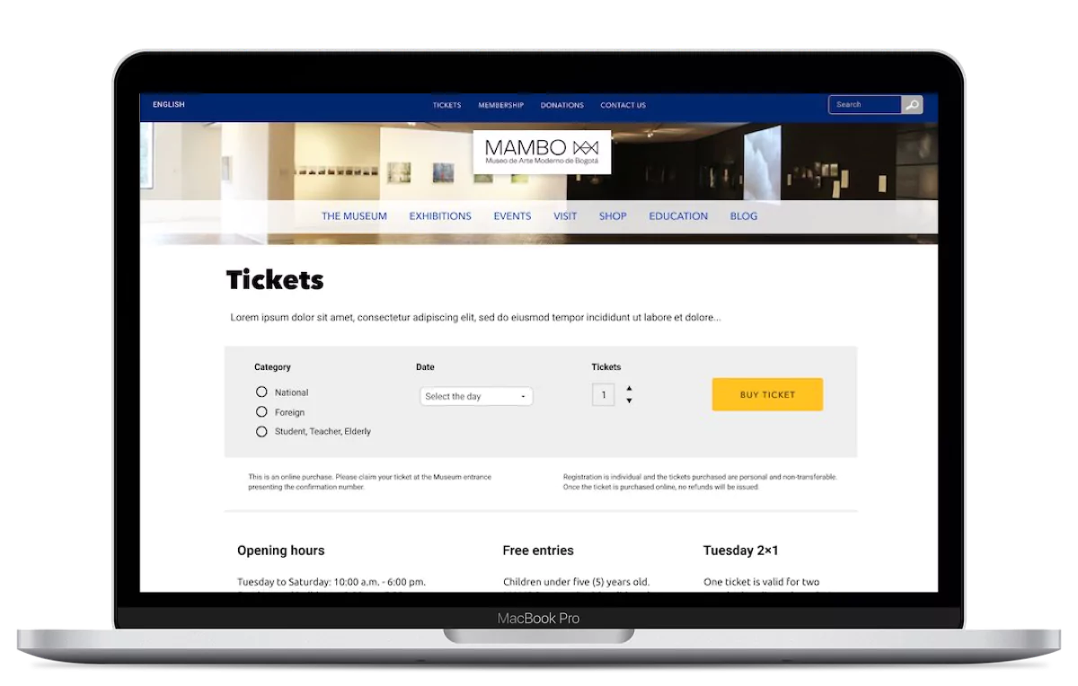
Improve the experience when a user purchases tickets online.
The design must be user-centered, delivering a memorable and seamless experience.
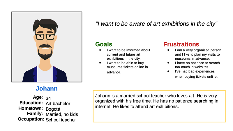
The user
Pain points
Design
Users think that museum websites are boring and unattractive. The current website design has an old-fashioned style.
Experience
Users want a safe and easy way to buy tickets online.
Information
Users see too much information on the current site but few images associated with the exhibits.
Navegation
Users find it difficult to understand what information they can find and how it is organized.
Empathizing
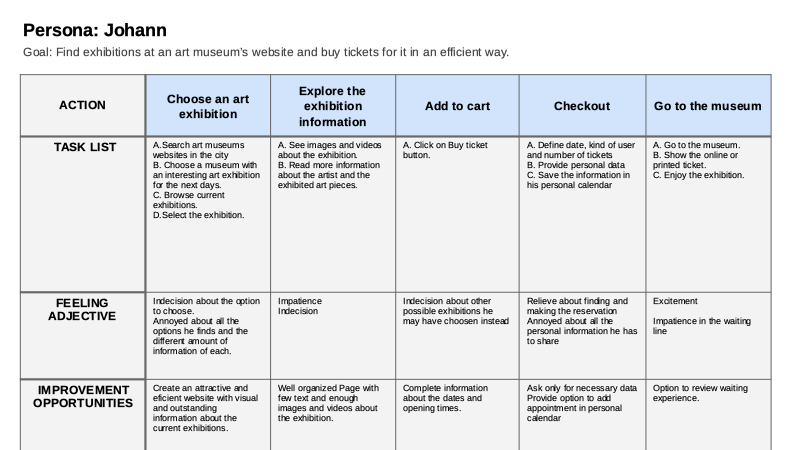
To understand the user’s relation with the website and the museum I worked with Personas and Empathy maps.
Design process
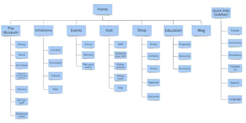
Architecture – Sitemap
The structure of the website was redefined based on the information published by the Museum and the real needs of users. The structure presented by other similar museum sites worldwide was also taken into account to rethink hierarchies.
Wireframes
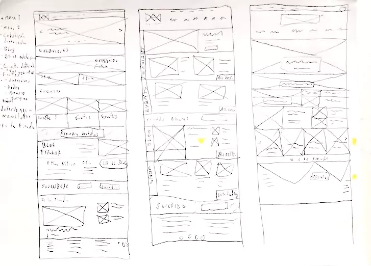
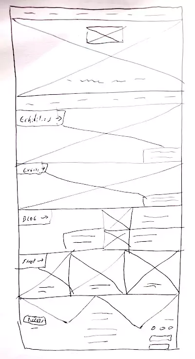
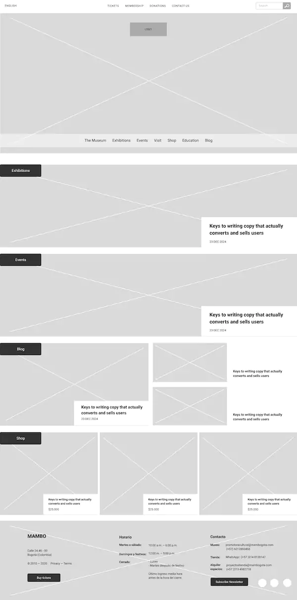
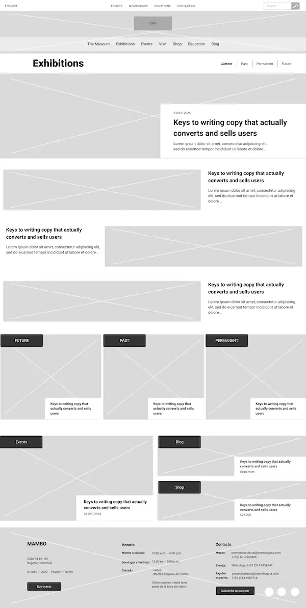
I explored ideas for the design through paper wireframes that I refined in digital format.
Digital prototypes
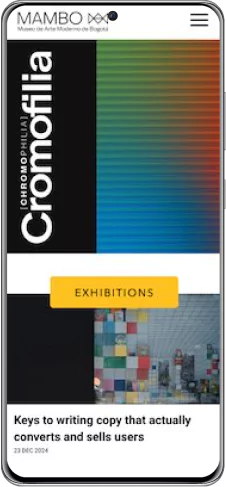
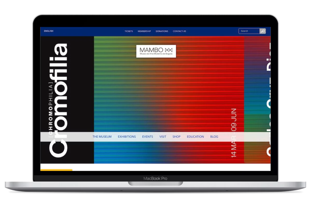
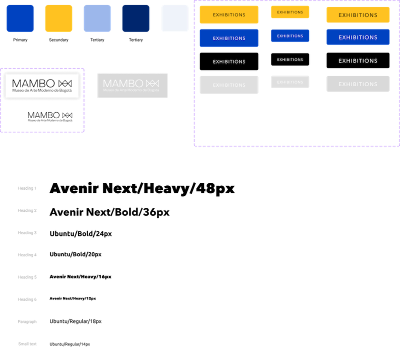
Later I defined the design system and the visual language of the interface, taking into account the institutional color palette and the corporate image used in other pieces of the museum.
I also designed the first version of the home page.
Usability study
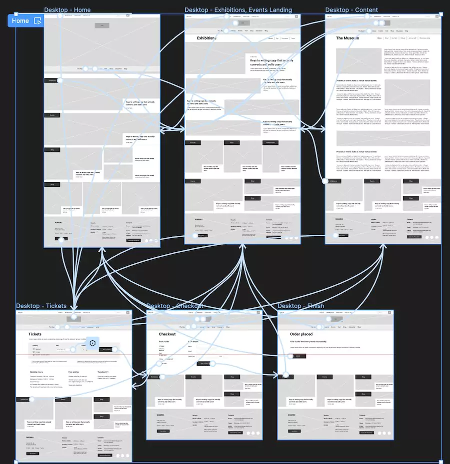
Using the low-fi prototype, I conducted a small usability study with users who usually visit art museums in various countries to validate the first version of the main flow.
Improved digital prototypes
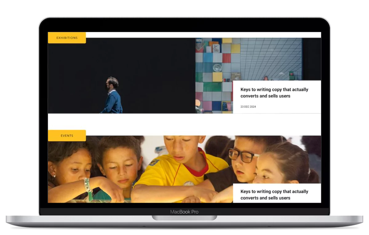
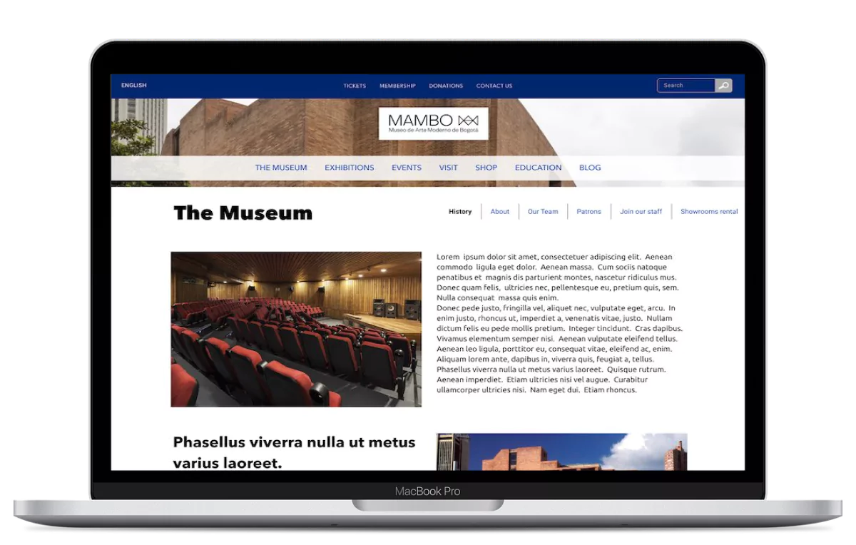
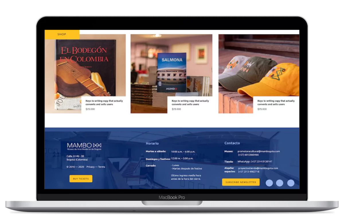
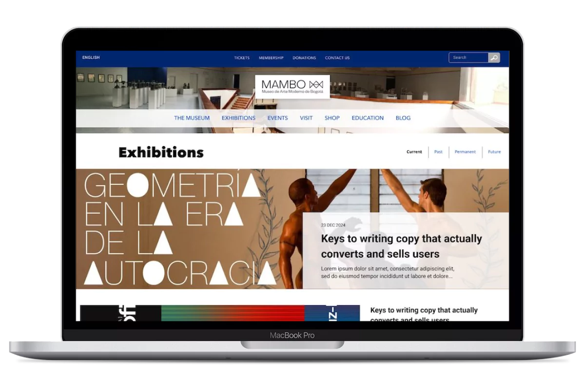
After evaluating the findings from the usability study and using the visual parameters defined in the initial mockups, I designed the final prototypes.
Conclusions
Impact
The new design and organization of the website was well received. Users noted that the use of attractive, large-format images draws them visually to the website. The color palette used and the way it was used was also a key factor. They also stated that the clean design with little text helps them easily understand the information and select only what they need.
Learnings
Listening to user’s expectations about the product was a key element in the ideation process and the user feedback at an early stage helped me avoid some solutions I was thinking about. Leveraging the client’s image supplies and carefully selecting the color palette over several iterations helped me define the final solution.
