Overview
The problem
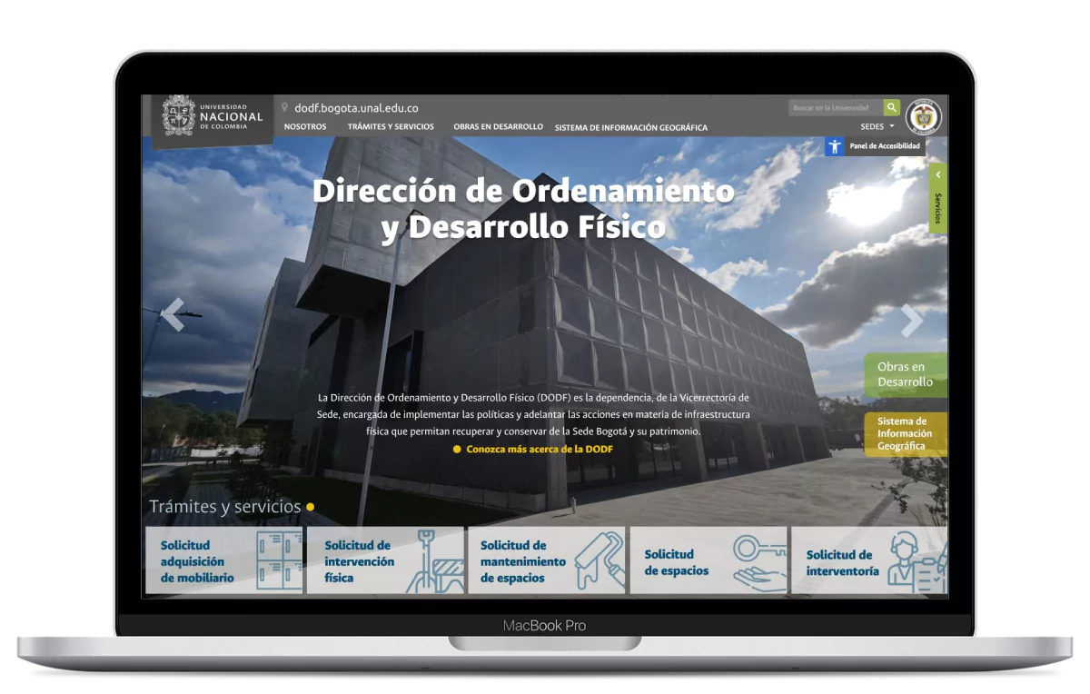
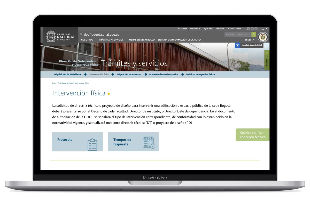
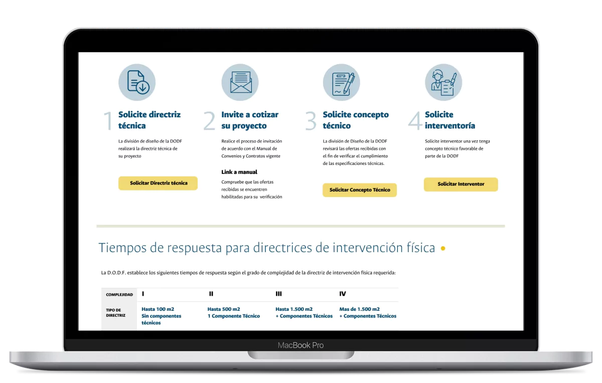
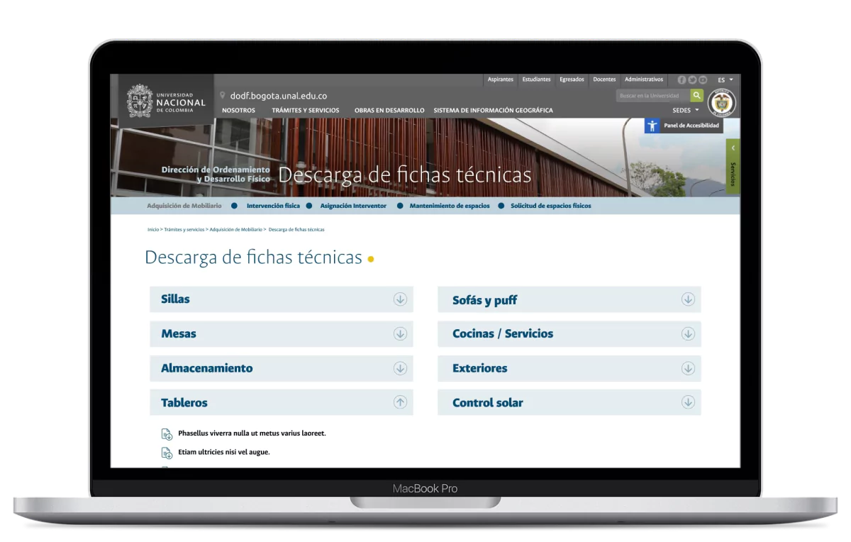
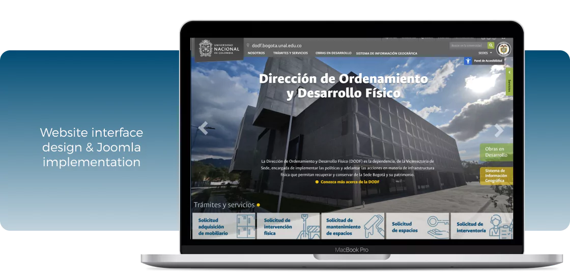
The Department of Planning and Physical Development (DODF) of the National University of Colombia needed a website to disseminate its services and make the guides for carrying out procedures with this office available to all areas of the institution.
* The project should be developed on a CMS authorized by the University, with wich the institution could update its contents autonomously, so we agreed to use Joomla.
The team
Felipe Silva
(UX designer and developer)
The goals
Have an effective system to publish information about the DODF and the services it offers.
Provide a place available to all offices to consult and download the guides to carry out procedures through the DODF.
Exhibit the projects developed by the DODF in a dynamic and organized way.
The user
Pain points
Users did not have access to the procedures guides and other information needed to make requests.
The process of requesting resources from the DODF was very slow and complex.
The website was incomplete and only had basic and outdated information.
Empathizing
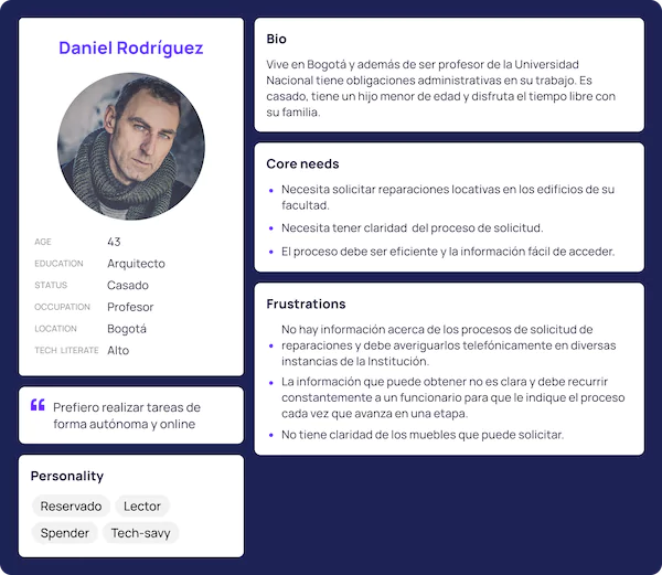
The user profile and the tasks to be performed were very specific.
- Personas
- Empathy map
- User Story Mapping
- StoryBoard
Design process
Architecture -Sitemap
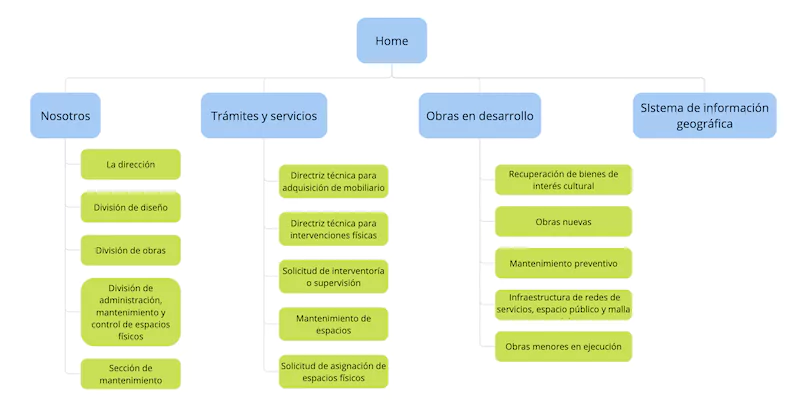
The client had already defined the navigation scheme and the flows that the user should follow, which served as the basis for putting together the architecture of the site.
Wireframes
I started the design process by defining wireframes for the main screens, taking into account that it was mandatory to use the institutional header and footer as a frame for the website.
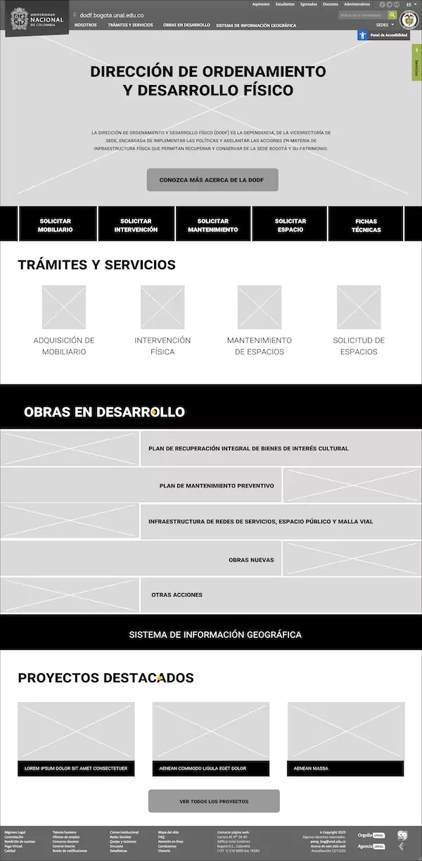
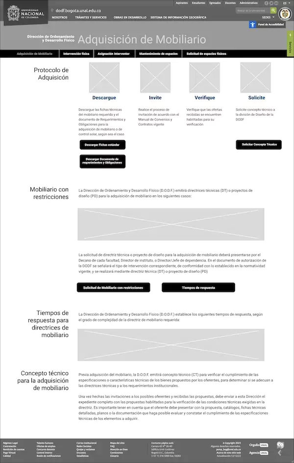
Digital prototypes
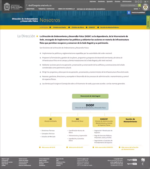
Once I finished the elements that the main interfaces should have, I defined the design parameters and implemented them in the first mockups: typography, colors and hierarchies. Following the corporate image policies, I used the institutional font.
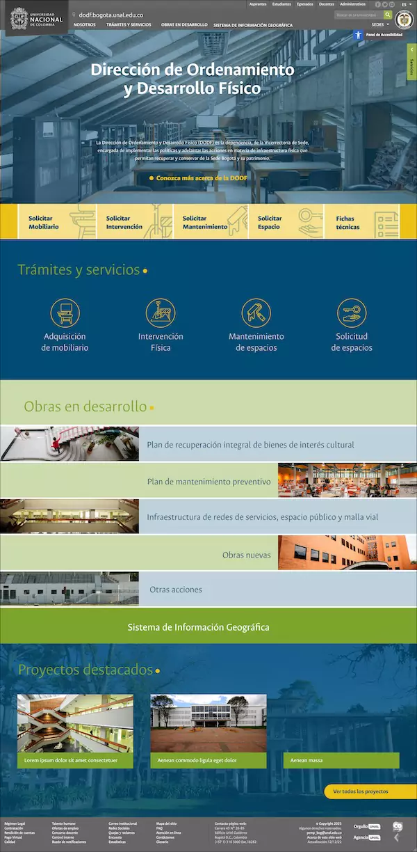
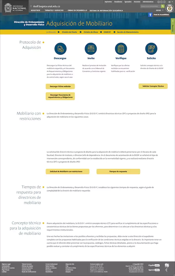
Feedback and iteration
Next, I presented the design proposal to a group of 10 people from the office, with various roles and involved in different stages of the processes carried out by the entity.
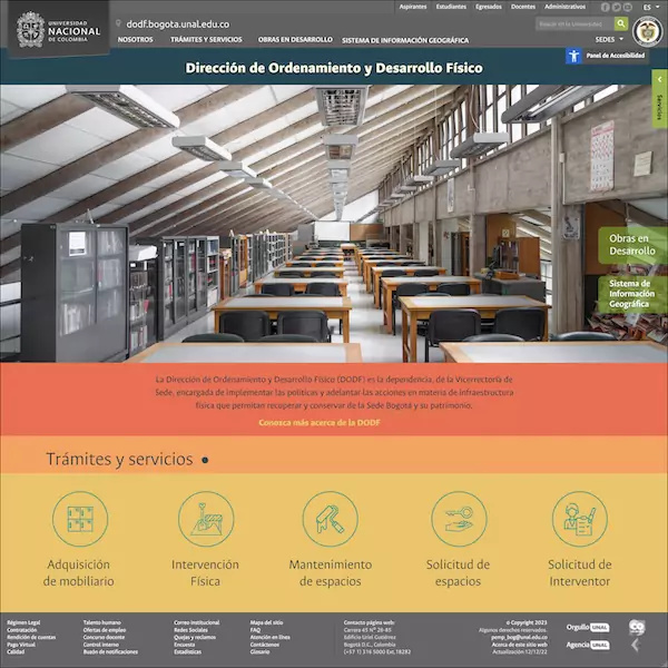
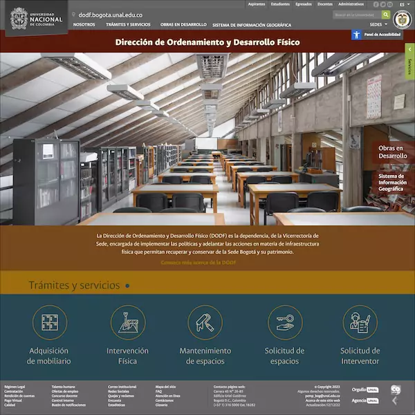
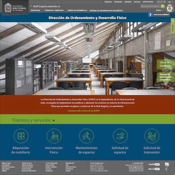
Based on the feedback, I made adjustments to the structure of the home page and presented 3 alternative color proposals.
Improved digital prototypes
Together with the client we decided to keep the initial color proposal and make some additional adjustments to the layout, simplifying the home page.
Finished and published product:
https://www.ordenamiento.bogota.unal.edu.co
Conclusions
Impact
- This new website will simplify the request process from other institutions.
- The information about the formats and works produced is now available online, information that previously could only be requested by telephone.
- The website gives visibility and positioning to the office within the institution.
Learnings
- Having the information and user flows defined from the beginning, validated by different actors, were crucial in the efficient execution of the project.
- Feedback from different profiles of real users involved in the processes, and not fictitious users or only with similar profiles, allows effective validation of the design.
- Sometimes initial ideas become the definitive ones, after a process of iteration that ultimately strengthens that idea.
